4.30.2009

INVITATION DRESS AT RED TREE

Oh, Red Tree, you have done it again! Not only are the window displays FABULOUS, (best in baltimore 2008!) the in-store displays are gorgeous as well! Right now Red Tree has a wedding themed table right inside the front door for all your wedding and bridal shower gift needs. They asked us if they could use some of our invites in the display. Now, we'll admit, we didn't think they could do it... We gave them the most random assortment of colors and styles and somehow they pulled it together into one pretty dress! It's really fun to see our work in such a beautifully designed store. We are honored. Thank you Red Tree!


4.29.2009

CORPORATE ID


Hem and Haw Designs is an event and styling studio run by Katie Watts, one of our favorite brides. If you follow our blog, you'll have gotten quite familiar with her invitations by now. Her wedding was also recently featured in Bride and Bloom magazine for spring 2009. She is a blast to work with and the unique design and colors of these calling cards speak to the kinds of styling and events Katie does. Just this past weekend she thew a Dr. Seuss themed baby shower for a mom with twins (thing two and thing one). I cannot wait to see those pictures!

4.28.2009

FROM THE DESK OF


Yesterday's inspiration really got me feeling sentimental and I wanted to show a project that is dearer to me than most. My grandmother recently finished writing her memoir, and commissioned us to produce a short run of 60 softbound books that she could give as gifts to each of her children and grandchildren. The book is 35 pages, with a photo collage as the end sheets and a cream satin ribbon binding. The books were then packaged in 7.5 inch square boxes printed with the same cover as the book so as to preserve them for years and years to come.

4.27.2009

INSPIRATION


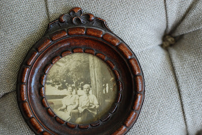
This is one of those things that I have had for years, and yet EVERY time I see it, my heart just smiles. I LOVE it. I really do. And the funny part about that is, I don't have any idea who these people are, I don't know their stories, and I have no sentimental attachment to them - yet this frame, their pose, the slow fade to yellow of this photograph, I don't know where I would be without it. We moved this weekend, and I went back to the old house this morning to do another walk through, and there is was, all by itself on the back of the door, a tiny little 3 inch frame, holding it's own in an empty house. It felt quiet, and calm, and somewhat sad. Until I packed them up in crinkled white tissue paper, and set them gently on the passenger seat of my car, to make the journey to our new house, to find their perfect spot, to keep watch over our lives here, as if they were my grandparents. I will carry them around the house with me, trying them in different places, until they find their new home.

4.24.2009

FEATURED PROJECT : GARDEN WEDDING


These wedding invitations are something we finished up recently for darling Mia over at Garnish Boutique. She is getting married this June in an outdoor Garden ceremony. She requested, peonies, dragonflies, bees and bugs! Mia is in the wedding industry herself and understands the importance of paper goods in a wedding! We really stopped at nothing with this set. There is calligraphy style guest addressing, printed envelopes, die cut reply cards, even lined reply envelopes. It is a gorgeous set and it really reflects the tone of the upcoming wedding.

4.23.2009

UNPREDICTABLE

Well Thursdays on the schedule are a little less predictable. We've decided we need at least one day of spontinaity, and just through the luck of the draw, Thursday won it! On Thursdays we'll post whatever we feel like!

Today it is a little bit of heaven. I WISH I could say I went out and bought the Pantone paint, but I didn't. We just went to Home Depot with a Pantone swatch and found the closest match! What might you ask is painted such an insanely bright pink? Well, for starters, let's say this color is an Ode to Hampden, it's called Flamingo Pink.... and it lines the insides of the closets in my husband's and my brand new house! We painted the closets pink, for a little element of surprise and whimsy. It just puts a smile on your face. And aside from tying it in to design by choosing colors based on Pantone matches, it reminds me of an envelope liner. See how I did that? Enjoy!

4.22.2009

CORPORATE ID


Wednesdays on the new schedule are going to be focused on corporate clients, so to kick it off, we are featuring Baltimore's very own "GIRL ABOUT TOWN," Stephanie Bradshaw! Stephanie came to us when she needed to re-brand her ID to convey all the different design services she offers under one fashionable umbrella. She offers retail, event and interior design as well as a fabulous newsletter titled Girl About Town. Stephanie came to us with some existing elements and we took those and ran with them. The result, a simplified color palette, bold silhouette, and just enough swirl!

4.21.2009

FROM THE DESK OF

We are starting a new blog schedule here at the paperie! Mondays as you saw yesterday will always be INSPIRATION posts, and Tuesdays, FROM THE DESK OF. This is where we will feature current projects either in production or like this one, ready to be picked up.


These are the product of yesterday's inspiration post! Amy at Crimson and Clover asked us for help with her table for this year's Great Chef's Dinner. Her theme - a Parisian Patisserie! You cannot even believe my delight when she told me this! What we did was design & print the subtle light pink cake pattern on slim glassine bags, leaving the frame in the middle blank, then we printed the front of the menu with the title/design and the chef's name along the bottom, so they would show through the blank spots on the glassine. We printed the menu on the back. Pretty simple, but what a stunning result! We rounded the corners and added a ribbon for a little decoration and function, it makes the menu easier to pull out of the glassine sleeve. Best of luck to Amy at this year's event!

4.20.2009

INSPIRATION


Only the most cheerful and inspiring commercial ever made! I have been obsessed with it for months and have just been DYING to use as the inspiration on a project! Check back tomorrow to see the design inspired by this perfect beauty! Please be sure to follow the link below to see the whole clip!
This is the directors cut of a spectacular Miss Dior commercial by Sofia Coppola...

1.20.2009

A LITTLE BIT OF LUXURY


Seriously, It just makes you want to sit down at a clean quiet desk in a room with a view and a fireplace, and write all those friends and family you've been missing. Just a little peek of things to come as we work hard to get everything photographed for our brand new website! Stay tuned this year as we launch new and exciting projects!

1.17.2009

BALTIMORE BRIDE


The new Baltimore Bride is out for anyone planning a spring or summer wedding. We have these out at the shop for free, so swing by and pick one up as you start thinking about your invitations. We have many great things featured in this issue, from favor packaging to themed invitations. More pictures to come!

1.13.2009

BRIDE AND BLOOM


RUN out to the newstands and get your hands on a copy of Bride and Blooms Spring 2009 issue! It is packed with beautiful planning tips, color schemes, photography, wedding dresses, eye candy, and US! We are so honored to be featured in such a gorgeous publication. Katie Triplett and Mark Watts were married in September of 2007 at the Towers in Narragansett, Rhode Island. Katie was one of those brides we INSTANTLY fell in love with. She and Mark were so fun to work with. We've shown their invites on the blog before (check back in the old posts from 10.07.2007)
All the photographs of Katie and Marks wedding were taken by Kristen Spencer. Katie cannot say enough good things about Kristen, so check out more work on her site kristinspencer.com

7.29.2008

nothing but the BEST


We want to thank Baltimore Magazine for naming us best stationers in their 2008 "Best Of" issue. Thank you, Thank you, Thank you... and we want to give a nod to all the other hampden businesses featured in this best of issue! If you haven't gotten it yet, head out to the newstands now, it is chock full of great little places in the city that you won't want to miss!

6.11.2008

PRETTY IN PAPER


Our other "window"! We've been working on a bit of a new look for the store, and this pretty paper dress is our favorite new display. The dress is all paper, with little accents of vintage lace and a deep green ribbon that we carry in the shop!

UNDER THE SEA


The new window installed at the paperie this week. Whales in love. So cute!

1.21.2008

LOVE IS IN THE AIR


Just a sneek peek of things to come at the Paperie! We are just about to release our exclusive line of Valentine's and Sweetheart cards for 2008! They will be ready for sale in the shop early next week. We are so excited to be able to offer our very own line of cards. Each major holiday, we will be releasing new designs into the shop, and periodically throughout the year we will be introducing Birthday, Thank you and everyday cards. Everything we do is custom, so keep us posted about what different types of things you might like to see! Thanks for your patience as we have been away! More frequent blogging to come.

12.09.2007

JUST A LITTLE SHIMMER


Custom Holiday cards for Garnish Boutique, with little blue rhinestones for a little glitz!

12.04.2007

BLACK & BLUE


There are so many products in this shot, I cannot list them all... to mention a few, we have beautiful letter openers, wonderful boxed sets of stationery, Christmas cards, and then some really terrific sets of patterned gift boxes so you don't even need to wrap your gifts this year - just pop them in a box, tie a ribbon on and you are good to go!

IT'S BEGINNING TO LOOK A LOT LIKE CHRISTMAS...


It really is. Here is the view out our window at the shop. Sorry for all the reflection from our laterns. It gets really pretty when the sun goes down, I love the way the logo on the glass becomes so clear against the dark outside. You all cannot miss Hampden at Christmas time! Not only is the shopping spectacular, a few blocks down on 34th street each year, the lights are on for Miracle on 34th street, a Hampden Holiday tradition! The next shot is just a bunch of boxed notes and individual greeting cards we have on hand, and the third is just a reminder that most of the smaller items we stock in the shop make awesome stocking stuffers and Secret Santa gifts! {stocking from Churchtown Chapeau Co. my not so secret side business!
http://chapeauco.com}